New LEGO DUPLO logo revealed on official online store
A new logo for LEGO DUPLO has been revealed on the official online store but is not to be found on the first wave of 2022 sets.
LEGO DUPLO has already revealed that bath time builds have come to the theme for younger hands this year, with 10964 Bath Time Fun: Floating Red Panda, 10965 Bath Time Fun: Floating Animal Train and 10966 Bath Time Fun: Floating Animal Island all available now.
However, the trio features what has now been unveiled as the old logo for DUPLO with a new version being spotted on the main page for the theme on the official online store.
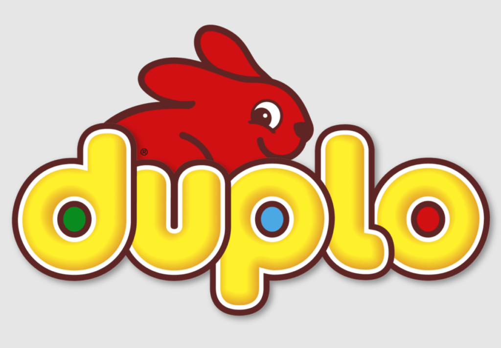
The updated iteration maintains the key elements of the logo including the yellow rounded font and the red rabbit, though the rabbit is now posed towards and looking directly at the camera, leaning on the words as it does.
Much of the font remains the same, including the three coloured dots. However, a shadow has been added to them to give a sense of depth. Since this logo is missing from the current 2022 sets, it is likely that this is a recent change to the theme and that future packaging will reflect the update.
This is just the latest update to a part of the LEGO Group’s brand, which is likely to be explored further this year as the company celebrates its 90th anniversary.
Support the work that Brick Fanatics does by purchasing your LEGO through our affiliate links.




Complaining about logos and redesigns are as useful as shouting at a cloud, but I’m going to anyway, because I love the brand so much: What a shame. The rabbit already looks dated, when other previous designs are timeless, as is LEGO itself. It also loses any suggestion of a system. 95-02 is the smartest in my opinion – and never warranted a redesign, even back then despite the ‘3D’ trends. I quite like the new type though, the shadow being reintroduced and losing the gradient shading. For a company where consistency is at the heart of their product, I wish they would do the same with their branding. I’ll try and write a positve comment when they revert back to a better version in 7 years.